
June 28th, 2007
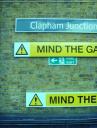

Hi, it's Fiona here. As Philip and I meandered back after the cricket to the paradise that is SW11, we noticed this signage at the station. Now, I'm not a creative but even I can see this is rubbish. There are several points that should be made:
1) none of the signs line up - not even in a post-modern, cool random way.
2) the top MIND THE GAP sign is covering part of the FIRE EXIT sign. I can feel myself getting cross again. This is pure laziness. Why does the sign-installer not care?
3) there are TWO MIND THE GAP signs. Perhaps the top one (at eye level) is for your average Joe Public, and the lower one is for all the people who have had too many blue drinks at Infernos or the Grand and are crawling across the platform in a vague attempt to get home. I guess we'll never know...
ps, I know the pictures above don't line up - just thought a little irony might be appropriate!!


No comments:
Post a Comment